A long High Street frontage, made to feel like one brand.
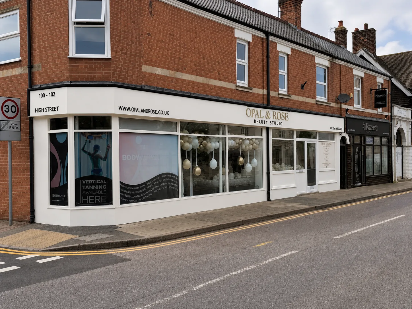
Opal & Rose needed a shopfront that felt calm and premium across a wide corner unit, while remaining clear to passing traffic.
The brief
The fascia runs across two elevations and carries several practical messages, so the hierarchy mattered. The studio name had to lead; the address, web details and service information needed to support it without making the frontage feel busy.
What we delivered
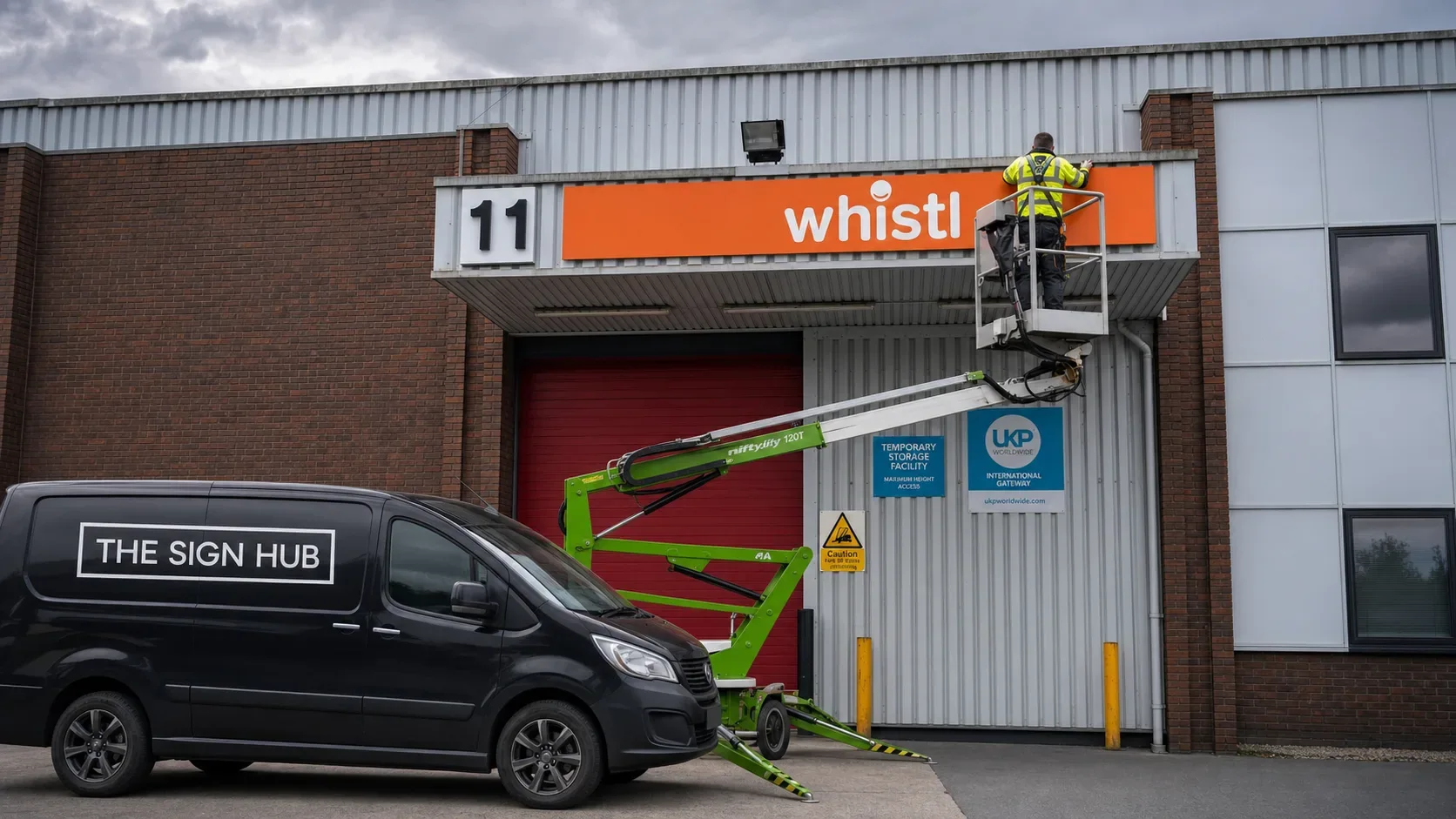
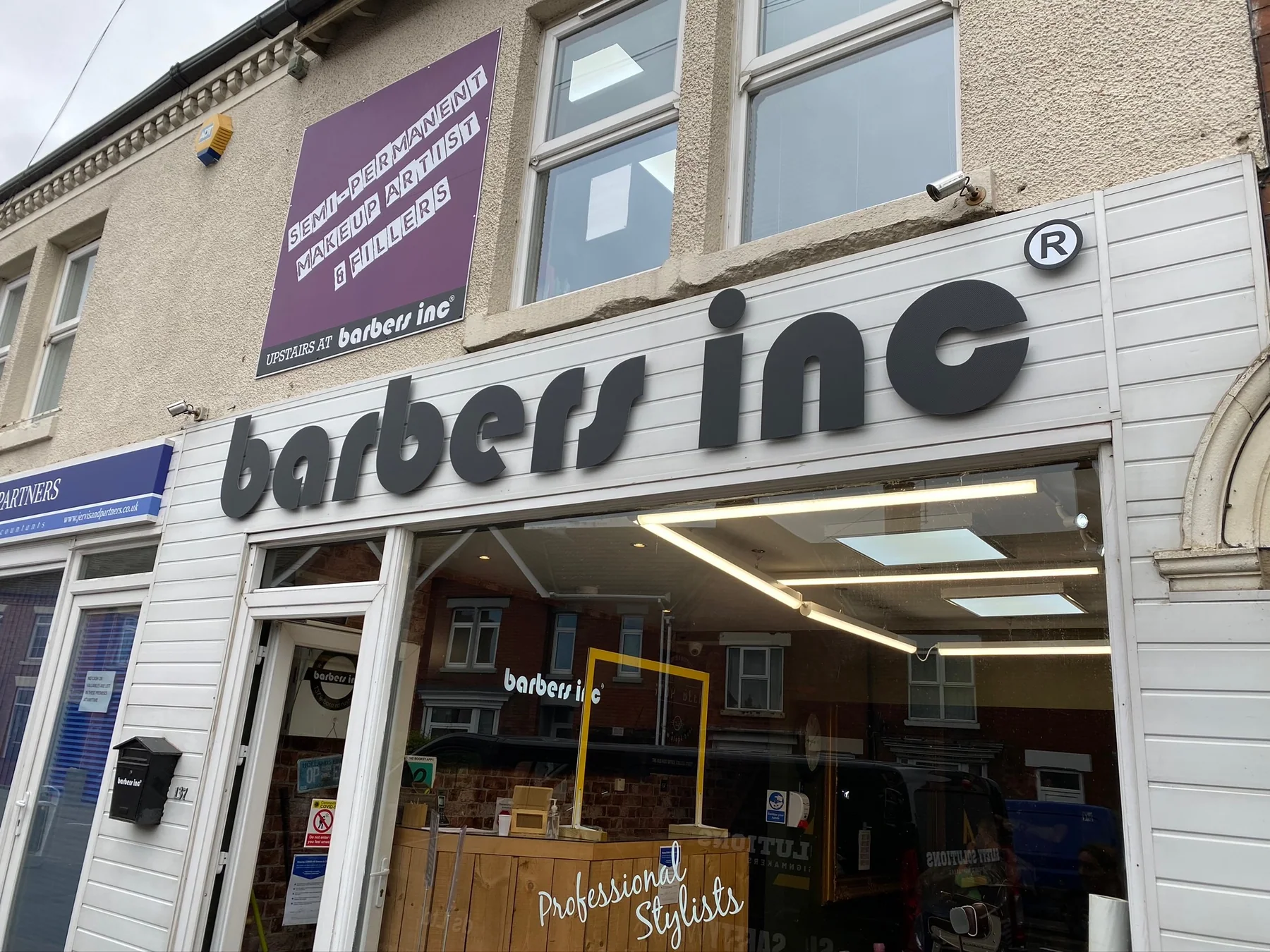
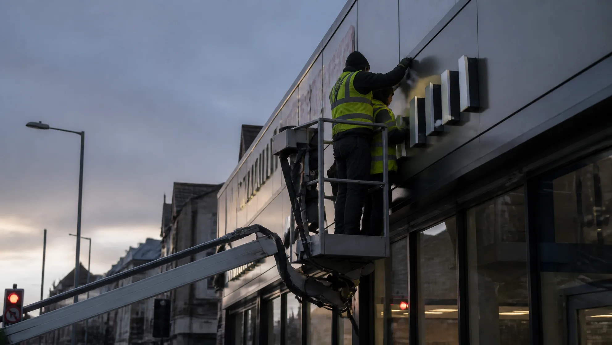
We used a light, restrained fascia treatment with dimensional metallic-effect lettering for the main identity, then kept every supporting detail crisp and dark. Window graphics and entrance information continue the same visual language at eye level.
Why it works
The completed frontage reads as one considered destination rather than a collection of separate panels. The name is visible from across the road, while the closer details reward customers as they approach.
- Fascia signage
- Dimensional lettering
- Window graphics
- Installation